PIXI.JS Optimizations
I was recently working on speeding up a MIDI editor UI written in PIXI.JS which is part of my web synth project. The UI is fairly simple itself, but it needs to be efficient in order to render potentially thousands+ notes on the screen at once.
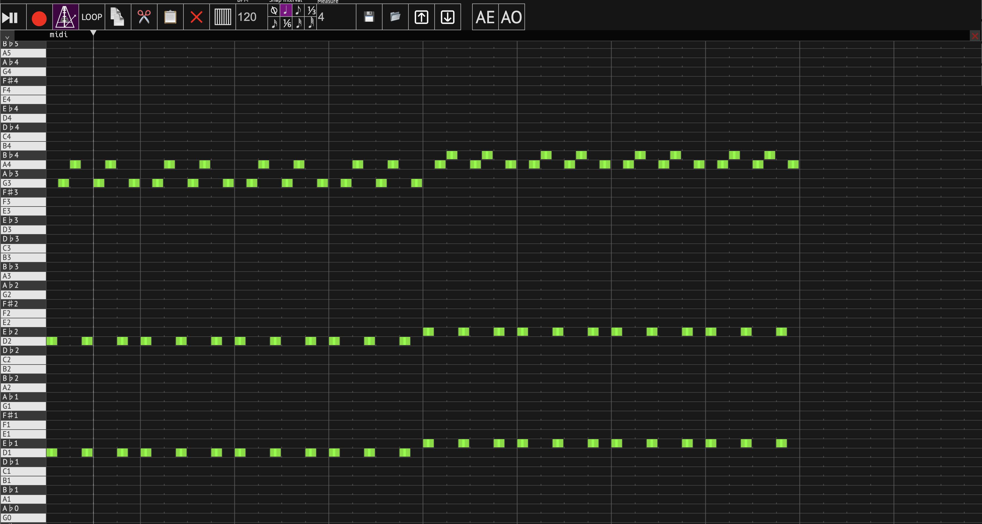
Here’s what the MIDI editor UI looks like:

As I mentioned, I built this whole UI with Pixi.JS (except for the toolbar which is vanilla HTML/CSS/React). For the most part, it was working well. It supports zooming, scrolling/panning, and adding/removing/moving/resizing notes. All of the interactivity was handled by PIXI.JS through its events/interaction system.
I was looking to add a new feature to the MIDI editor for adding custom labels and annotations to some notes to support use cases where the MIDI editor controls a sampler or something similar where only some notes were active. However, when I went to start implementing it, I noticed that the MIDI editor’s performance was quite bad. It was using >80% of my GPU on my M1 Macbook Max to just render the base MIDI editor UI and a single note.
For an almost completely static UI, this was absurd. I felt strongly that there would be some low-hanging fruit to speed it up, so I went looking.
I tried several things to get this UI to render faster. Here’s a list of some of the things I tried to speed it up.
Avoiding Mask Usage⌗
For the piano keyboard on the left, I rendered the whole thing inside of a PIXI.Container and then used a simple rectangular mask to cut off the top part so that it wouldn’t render underneath the cursor gutter bar.
I used code like this to set that up:
this.container.mask = new PIXI.Graphics()
  .beginFill(0xffffff)
  .drawRect(conf.PIANO_KEYBOARD_WIDTH, 10, this.width - conf.PIANO_KEYBOARD_WIDTH, this.height)
  .endFill();
According to the Pixi.JS docs, this kind of mask is the cheapest and should be applied using WebGL’s scissor testing. However, I found that in practice it slowed down my rendering significantly. It seemed to be going into some kind of rendering slow path that was slowing down the whole application.
I opted to just get rid of the masking entirely and instead extend the cursor gutter to the left and force it to render on top of the piano keyboard using zIndex and app.stage.sortableChildren = true. This achieved the same effect but made it easier to PIXI to render.
Using Spector.JS for Profiling + Debugging⌗
To try to figure out where the application was spending its time rendering, I used a browser extension called Spector.JS. It’s a WebGL profiler/debugger that I’ve used in the past to debug and profile Three.JS applications.
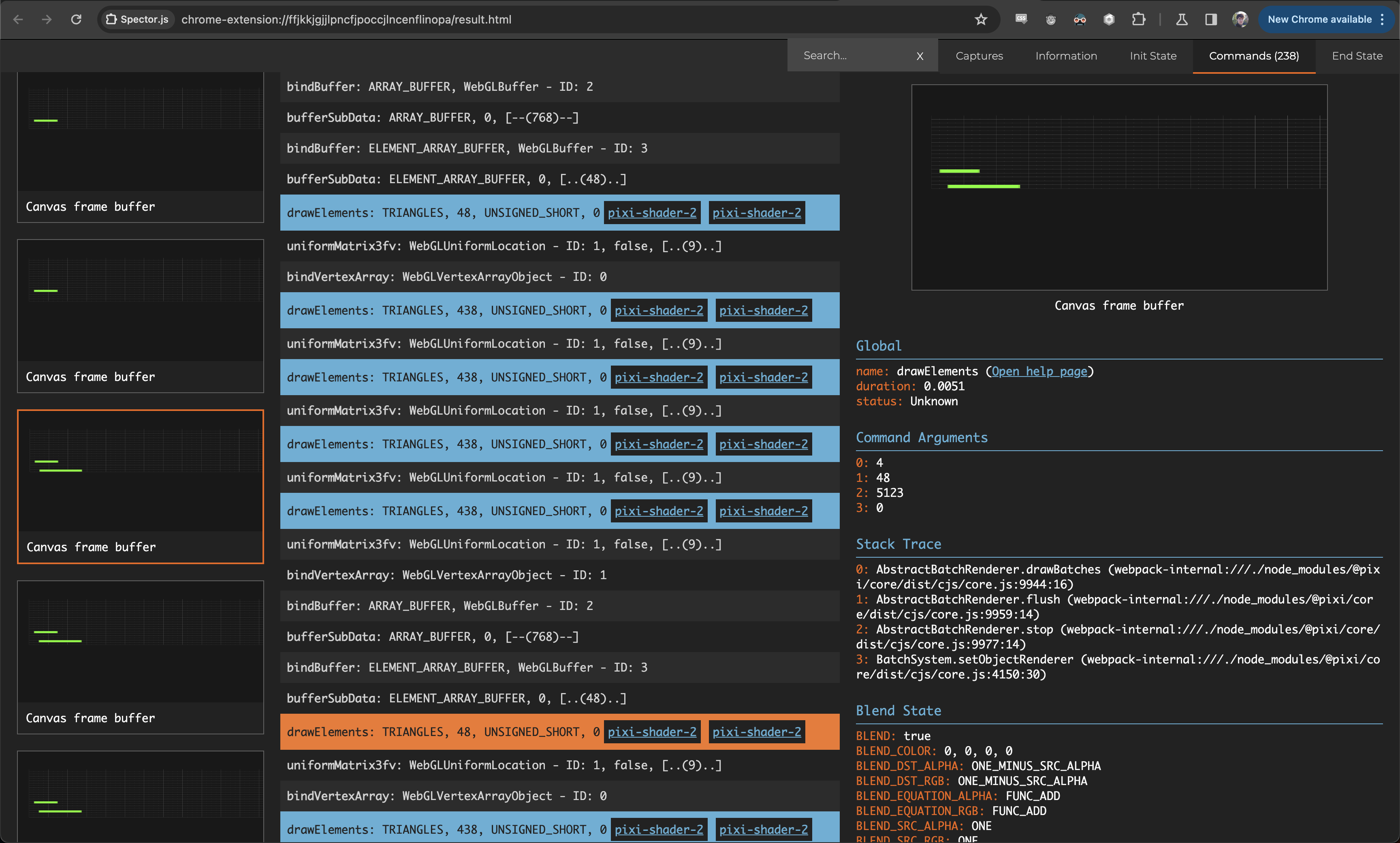
Since PIXI.JS uses WebGL under the hood to render, Spector.JS can be used to analyze all the render passes. I loaded it up, selected the main canvas, and collected a profile. Here’s what I saw:

Overall, it was taking 238 commands to render the whole UI. This isn’t an enormous number (some complex 3D scenes can use thousands or more commands to render) but it’s a lot more than should be necessary for such a simple UI.
One thing that was clear was that each of the lines was being rendered one by one. This surprised me; I was using a PIXI.Graphics with cacheAsBitmap = true to render those lines and ticks, and I was using the same instance for each line. I expected that this would activate PIXI’s optimizations and cause those to all get rendered together as sprites, but that evidently wasn’t the case.
If there were multiple notes in one line, they were all getting rendered together in one pass, though, even when the little handles on either side for resizing them were included.
Upgrading PIXI.JS⌗
I also took the opportunity to bump PIXI.JS to the latest version (7.3 at the time of writing this). Sometimes you get lucky and get performance for free when doing that.
Unfortunately, this was not one of those cases. Performance seemed pretty much the same after upgrading. Still a good thing to do, though, and I’ve been meaning to get to it for a while now.
Pre-Rendering to Sprites⌗
My main goal after seeing that info from Spector.JS was to try to get the note lines rendering more efficiently. I knew that PIXI.JS had put extensive optimization into sprites, so I figured using real sprites rather than the cached graphics was a good idea to try.
I switched my note lines + tick markings to render into a PIXI.RenderTexture explicitly ahead of time, and then created sprites out of that shared texture:
const g = new PIXI.Graphics();

// ... rendering line and ticks based on current view + pan ...

const renderTexture = PIXI.RenderTexture.create({
  width: this.app.width,
  height: conf.LINE_HEIGHT,
});
this.app.app.renderer.render(g, { renderTexture });

MarkersCache.set(markersCacheKey, renderTexture);
return new PIXI.Sprite(renderTexture);
Whenever the zoom level of horizontal scroll of the UI changed, I’d re-construct the texture for the markers and re-create the sprites. After a bit of tweaking, I got it working as it was before, and performance was greatly improved!
Pre-Rendering Containers vs. Children⌗
The main bottleneck remaining that I could see was the piano keyboard. Each of the keys consisted of a colored PIXI.Graphics to render the key background + border as well as a PIXI.Text for the label.
For each of the keys, I rendered the background and the label separately and set .cacheAsBitmap = true for each of them. Then, I set them into containers, added those containers to the base piano keys container, and set them up to render in the correct order.
As it turns out, this was a sub-optimal pattern for Pixi to work with. Pixi had to create separate textures for all of the dozens of text labels and render each of the keys separately.
The piano keyboard is mostly static; the only thing that changes is the Y offset with the current vertical scroll, and some pink transparent indicators are rendered on top of it when notes are actively playing.
Taking advantage of this, I pre-rendered the entire piano keyboard into a bitmap by setting the parent container .cacheAsBitmap = true. This means that PIXI was able to save the whole thing as a single big texture and then render it all at once.
This unsurprisingly sped things up significantly. I had to add a little bit of extra handling to the active note indicators, including the label in them again since they were rendering between the labels layer and keys layer previously, but it wasn’t that big of a task.
Results⌗
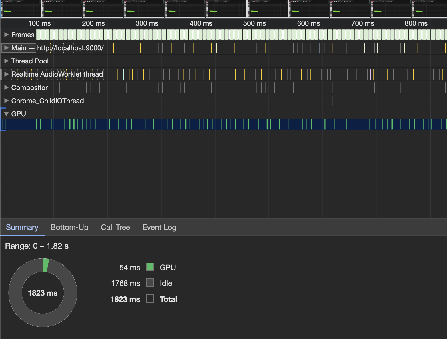
After all that optimization, I ran some more profiling to see how effect it had:

That’s what I’m talking about! The GPU is basically idle - as it should be for this UI.
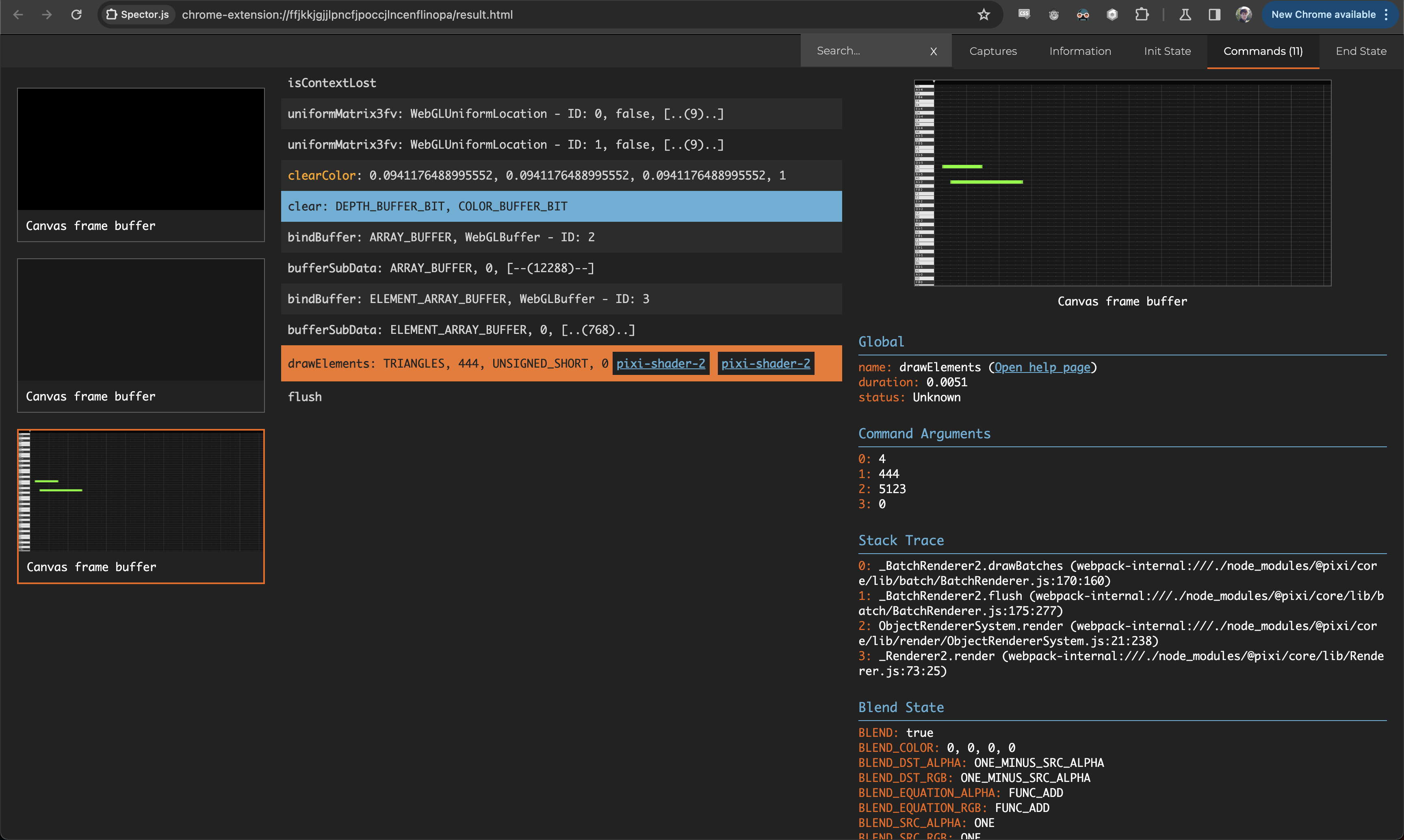
I also ran another Spector.JS profiling run to see how the render pass count had changed:

The whole thing renders in a single render pass now!!
I was quite shocked to see that honestly. PIXI.JS was finally able to show off its impressive capabilities here. I’d be interested check out their code to see how it manages to do that at some point.
So yeah - a very successful optimization journey indeed. PIXI.JS needs some things to get set up in the right way in order for it to really shine, but it excels when they are.