My Thoughts on the uPlot Charting Library
TL;DR:
uPlot is a Spartan charting library that focuses intensely on minimalism and performance. It feels very much like a tool made for hackers, and it lacks many of the features and embellishments of fully-featured charting libraries.
The main downside is that it has quite terrible docs and sometimes has confusing APIs
I’m personally a big fan of its aesthetic and design goals, and I will probably be sticking with it as my primary charting library for the web for the forseeable future.
A lot of my projects end up needing to render some kind of chart in the browser, often using dynamic data. Over the years, I’ve explored a range of different charting libraries. I started off using Highcharts, then ECharts was my favorite for a few years, and most recently my go-to choice is uPlot.
uPlot self-describes as “A small, fast chart for time series, lines, areas, ohlc & bars”
It’s certainly a very minimal charting library compared to complex offerings like ECharts, but it more than makes up for that. Its bundle size is under 50KB for one which is really impressive. Compare that to the ~1MB bundle size for ECharts.
That being said, I can’t think of a time I’ve hit a wall with uPlot because it was lacking some feature I needed. I feel that it covers >95% of the surface area for common and uncommon charting needs for the chart types it supports.
It’s also intensely focused on performance. It renders to a canvas using WebGL which makes it possible to scale way further than libraries like D3 - which render to SVG - can ever reach.
uPlot is optimized to both have an extremely fast initial render as well as scale to supporting huge amounts of data points at 60FPS+. It is seriously fast - here’s one of their demos that effortlessly renders millions of data points: https://leeoniya.github.io/uPlot/bench/uPlot-10M.html
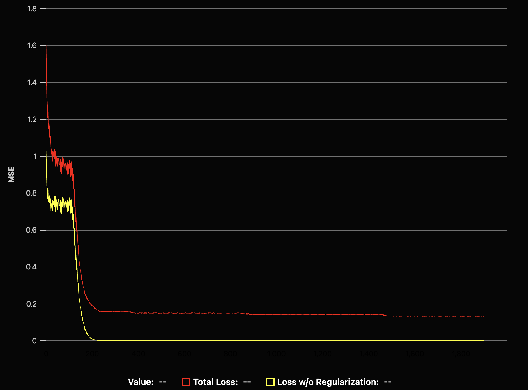
Its UI design is quite minimalistic, and that’s certainly their goal. The library explicitly avoids things like fancy animations when rendering things in or design flourishes in favor of minimizing latency and responsiveness. Here’s an example of the kind of line plot you will get out of it with more or less default settings for things:
Personally, I’m a big fan of its aesthetic. It fits well with a lot of the kinds of web apps I end up building, and there’s very little work necessary configuring styles or theming. For comparison, bigger libraries like Highcharts or ECharts often require me to set broader theming settings in order to make the plots look decent on a dark background.
With uPlot, there’s simply less things to style, so I end up only really having to define series colors - if even that.
Drawbacks⌗
The main downside that uPlot has is that the docs are not good at all.
Pretty much the only docs that actually exist consist of one small Markdown doc. Other than that, you have to rely on reverse engineering the examples on their website or trying to figure things out based on the TypeScript type definitions (which are quite complete to be fair).
This is a real annoyance, though, and probably makes the library very unattractive to certain people. Setting up a basic chart is unsurprisingly very simple, but as soon as you want to do something like add a custom label formatter, tweak the tick spacing behavior, or use a non-standard line drawing mode, it’s a slog of finding an applicable example and reverse engineering it every time.
Compare that to the ECharts Docs. They’re extremely complete, very easy to search + browse, and have examples and codepens for pretty much every possible use case.
Conclusion⌗
As I’ve said before, I really like uPlot and I use it all the time. It’s the first choice I reach for in all my new projects, and I’m largely very happy with it. For the kinds of things I build, I have no need of the vast majority of the features that bigger libraries provide, and I’m happy to pay the tradeoff in exchange for the extremely tiny bundle size and great performance.
I really wish the docs were better, though. I’ve burned many hours digging through examples and trying to cobble together functionality from “View Source” in Chrome, and it feels like a big waste of time.